
More and more small devices are used to access the internet than ever before, as smart phones and tablets now receive more traffic than traditional computers. This has made it increasingly import to make sure your businesses website is accessible to all, regardless of how it is accessed.
Once Upon A Time...
When the internet began, websites were designed solely for use on desktop computers. The monitors which displayed the content were often square, as were televisions at the time. Fast forward a little, with the arrival of laptops and modern computers, the industry saw a change that standardised widescreen displays and TV’s.
A Decade Ago
Roughly 10 years ago smartphones didn’t exist. In 2007 Apple launched their first iPhone, a revolutionary tool that has since dominated our everyday lives. The introduction of the new handheld gadget, has presented web developers and business owners with a new challenge - how to enable their websites compatibility for not only a smaller screen, but one often viewed in a portrait orientation.
Present Day
Modern life moves at a quick pace. There is a demand to have the answer almost immediately and what easier way, than a few clicks on your mobile phone. With more than 2.5 billion smartphone users in the world, they account for more than half of the internet's traffic and often the first means of accessing the internet.
Websites On A Mobile
Let’s clarify a few things, not all ‘mobile’ websites actually do what they say on the tin.
Technology in smartphones is ever changing. For a website to be viewed properly, it must keep up and communicate properly with today’s devices. There are various mobile jargons out there, but not all are as compatible or user friendly as others.
"Mobile Site"
Invented as a solution for when smartphones could first access the internet, mobile sites often restrict content and simplify layouts to suit the requirements of browsers with limitations. This is now a dated setup, as smartphones are becoming more and more powerful.
Mobile sites are separate websites to the main ‘Desktop Site’. This is where a separate page is loaded when detecting a mobile phone. This adds complications where both versions require managing and maintaining. The double website method affects how Google sees the website and is penalised as these sites are no longer recognised as being “Mobile Friendly”.
"Mobile Friendly"
This is when a website identifies a portable device and shrinks the website to fit. This is often not actually friendly, as shrinking a page designed for a large screen, to a small screen, can leave viewers frustrated. In most instances you will have to pinch to zoom, and scroll across the pages to be able to read the now very small text and menus. Most of us will very quickly give up if are not presented with our desired findings or have difficulty navigating.
"Responsive"
The newest and most advanced option available. Admittedly it entails the most work for web developers (and subsequently more expense for the business owner) however the finished product offers an excellent user experience. So no need to zoom, or be frustrated when a feature designed for a laptop, doesn’t work on a phone. A responsive website intelligently alters its layout, including locations of menus and pictures, to the device it is viewed upon.
Who decides what?
Mobile devices accounted for 50% of the internet’s traffic in 2017… of which Google received 96% of all searches. So when it comes to getting found on the internet, you need to listen to what Google have to say. https://developers.google.com/search/mobile-sites/
Google have their own compatibility test, have you tried it before? https://search.google.com/test/mobile-friendly
SCRUMPY
At SCRUMPY our platform and in turn websites, have been built from the ground up to perform exceptionally well on all devices.
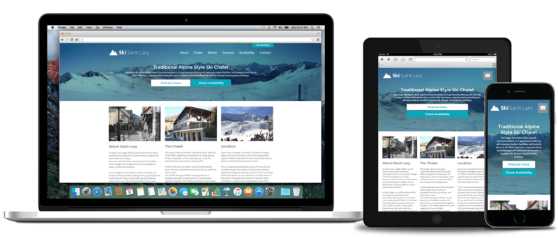
Without question all of our pages are responsive and we take particular care to ensure each and every feature is compatible, no matter what you want to do or what you are using.
Whether your customer wants to:
-
Look at pictures of your property
-
View your Availability Calendar
-
Look at testimonials or Tripadvisor reviews
-
Check the ‘Things to do’ map
-
View a floor plan of the property and descriptions of each rooms
-
Send an email, call or message directly on their phone
-
Place a booking quickly - Utilising autofill to complete the booking form & the option to purchase via Apple pay or Google Pay
-
Access ‘My booking’ - From where they can see an overview, check in details, adjust guests, directions, ask questions and make payments
Or as the Property Owner, Manager or Agency:
-
View your bookings - Sorted into categories such as: Awaiting T’s & C’s, Final payment due and Immediate Arrivals
-
Activity - See when guests have read their emails, made requests and payments
-
Notified - Set up alerts in the form of email or SMS
-
Manage social media - Write a post once, but update multiple accounts at the same time.
-
Housekeeper Portal - Allow booking start and end dates to be viewed for changeovers.
-
Content manage - Make amendments to your website, allowing ease of adding photos, changing text and adding new pages
-
Blog - Write, edit, preview and post new
-
Reports - Access to financials, success of channels and other business performance
-
Support - From our integrated help system
In short everything that SCRUMPY offers is available on all devices, with no limitations for you or your customers.
Get in touch if you'd like to find out more, or take a look at our work.